


monsitj/iStock via Getty Images
monsitj/iStock via Getty Images
This monthly article series shows a dashboard with aggregate industry metrics in technology and communication services. It may also serve as a top-down analysis of technology ETFs like the Fidelity MSCI Information Technology Index ETF (NYSEARCA:FTEC), whose largest holdings are used to calculate these metrics.
The next two paragraphs in italic describe the dashboard methodology. They are necessary for new readers to understand the metrics. If you are used to this series or if you are short of time, you can skip them and go to the charts.
I calculate the median value of five fundamental ratios for each industry: Earnings Yield (“EY”), Sales Yield (“SY”), Free Cash Flow Yield (“FY”), Return on Equity (“ROE”), Gross Margin (“GM”). The reference universe includes large companies in the U.S. stock market. The five base metrics are calculated on trailing 12 months. For all of them, higher is better. EY, SY and FY are medians of the inverse of Price/Earnings, Price/Sales and Price/Free Cash Flow. They are better for statistical studies than price-to-something ratios, which are unusable or non available when the “something” is close to zero or negative (for example, companies with negative earnings). I also look at two momentum metrics for each group: the median monthly return (RetM) and the median annual return (RetY).
I prefer medians to averages because a median splits a set in a good half and a bad half. A capital-weighted average is skewed by extreme values and the largest companies. My metrics are designed for stock-picking rather than index investing.
I calculate historical baselines for all metrics. They are noted respectively EYh, SYh, FYh, ROEh, GMh, and they are calculated as the averages on a look-back period of 11 years. For example, the value of EYh for hardware in the table below is the 11-year average of the median Earnings Yield in hardware companies.
The Value Score (“VS”) is defined as the average difference in % between the three valuation ratios (EY, SY, FY) and their baselines (EYh, SYh, FYh). The same way, the Quality Score (“QS”) is the average difference between the two quality ratios (ROE, GM) and their baselines (ROEh, GMh).
The scores are in percentage points. VS may be interpreted as the percentage of undervaluation or overvaluation relative to the baseline (positive is good, negative is bad). This interpretation must be taken with caution: the baseline is an arbitrary reference, not a supposed fair value. The formula assumes that the three valuation metrics are of equal importance.
The next table shows the metrics and scores as of last week’s closing. Columns stand for all the data named and defined above.
VS
QS
EY
SY
FY
ROE
GM
EYh
SYh
FYh
ROEh
GMh
RetM
RetY
Hardware
85.52
73.69
0.0644
1.5853
0.0782
18.25
38.03
0.0347
0.8961
0.0403
7.11
41.87
-8.01%
-5.29%
Comm. Equip.
-30.39
26.70
0.0295
0.1387
0.0274
23.04
63.67
0.0314
0.2839
0.0415
15.00
63.80
-6.69%
2.82%
Entertainment
-17.49
-9.24
0.0327
0.4433
0.0319
12.50
49.41
0.0503
0.4383
0.0392
17.31
45.20
-3.82%
-16.82%
Electronic Equip.
-23.71
43.12
0.0401
0.3628
0.0378
20.45
43.61
0.0438
0.8425
0.0401
12.64
35.05
-9.16%
-11.56%
Software
-22.56
9.51
0.0232
0.1238
0.0303
21.16
83.86
0.0276
0.1790
0.0383
17.40
86.12
-1.46%
-15.36%
Telecom
-42.22
6.74
0.0639
0.5954
-0.0145
13.65
57.86
0.0490
0.6489
0.0297
11.88
58.74
4.99%
-0.44%
Semiconductors
-9.75
19.40
0.0524
0.1962
0.0300
32.09
62.67
0.0470
0.2538
0.0366
23.26
62.15
-13.79%
-9.01%
IT Services
-27.12
3.09
0.0311
0.2187
0.0252
26.95
54.42
0.0393
0.3403
0.0335
24.82
55.75
0.72%
4.39%
The next chart plots the Value and Quality Scores by industry (higher is better).
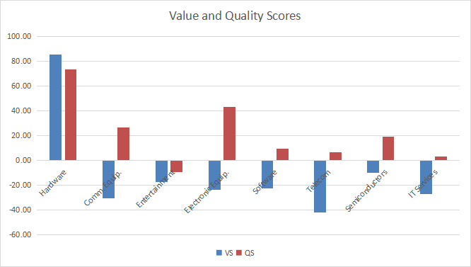
Value and quality in technology (Chart: author; data: Portfolio123)
Value and quality in technology (Chart: author; data: Portfolio123)
The most notable moves in value scores are an improvement in hardware and telecommunication, and a deterioration in IT services. Telecom has also improved in quality.
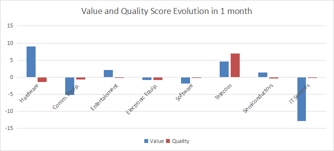
Variations in value and quality (Chart: author; data: Portfolio123)
Variations in value and quality (Chart: author; data: Portfolio123)
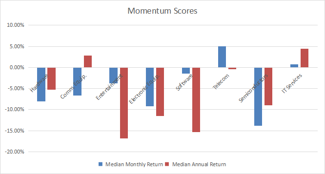
The next chart plots momentum data.
Momentum in technology (Chart: author; data: Portfolio123)
Momentum in technology (Chart: author; data: Portfolio123)
Hardware is the most attractive technology industry regarding my metrics. It is far above the baseline in both value and quality scores based on 11-year averages. Semiconductors are overvalued by about 10%, but a good quality score may justify it. Other industries are overvalued by 17% to 42% relative to historical averages. Good quality scores may partly justify it for electronic equipment, and to a lesser extent in communication equipment. Telecommunication is the most overvalued industry and entertainment has both value and quality scores in negative territory.
The Fidelity MSCI Information Technology Index ETF has been tracking the MSCI USA IMI Information Technology 25/50 Index since 10/21/2013. It has a total expense ratio of 0.08%, which is a bit cheaper than other passive index ETFs in the same sector like XLK (0.12%) and VGT (0.10%). As of writing, the fund holds 364 stocks. The next table shows the top 10 holdings with valuation and growth metrics. Their aggregate weight is over 60%. The top two holdings (Apple Inc and Microsoft Corp) weigh 40.5% together, which represents a high exposure to risk related to these companies.
Ticker
Name
Weight%
EPS growth %TTM
P/E TTM
P/E fwd
Yield%
AAPL
Apple Inc.
22.78
62.83
27.41
26.89
0.53
MSFT
Microsoft Corp.
17.73
39.98
29.85
30.01
0.88
NVDA
NVIDIA Corporation
5.44
122.95
56.66
38.52
0.07
V
Visa Inc.
3.03
26.04
36.13
29.98
0.70
MA
Mastercard Inc.
2.55
37.46
40.72
35.01
0.55
AVGO
Broadcom Inc.
2.1
103.86
33.43
16.49
2.80
CSCO
Cisco Systems Inc.
1.91
17.03
18.29
14.83
2.97
ADBE
Adobe Inc.
1.76
-12.37
42.23
31.18
0
ACN
Accenture plc
1.73
17.43
31.61
29.06
1.24
CRM
Salesforce Inc.
1.69
-65.81
124.57
40.12
0
Data calculated with Portfolio123
Since inception in October 2013, FTEC and XLK have identical annualized returns. XLK is a bit less volatile, but the difference is insignificant.
Total Return
Annual. Return
Drawdown
Sharpe
Volatility
FTEC
395.99%
20.80%
-31.48%
1.2
17.61%
XLK
396.03%
20.80%
-30.72%
1.24
16.87%
FTEC is a fund with cheap fees for investors seeking a capital-weighted exposure in technology. It holds much more stocks than XLK (currently 364 vs. 77), but past performance is the same: tail holdings have a low aggregate weight relative to S&P 500 tech companies. Investors willing to keep a position in technology for the long-term may indifferently choose FTEC or XLK. Liquidity makes XLK a better choice for tactical allocation and trading. For those who want to avoid overweighting Apple and Microsoft, the Invesco S&P 500 Equal Weight Technology ETF (RYT) may be a better choice.
I use the first table to calculate value and quality scores. It may also be used in a stock-picking process to check how companies stand among their peers. For example, the EY column tells us that a hardware company with an earnings yield above 0.0644 (or price/earnings below 15.52) is in the better half of the industry regarding this metric. A Dashboard List is sent every month to Quantitative Risk & Value subscribers with the most profitable companies standing in the better half among their peers regarding the three valuation metrics at the same time. The list below was sent to subscribers several weeks ago based on data available at this time.
KLIC
Kulicke and Soffa Industries Inc.
THRY
Thryv Holdings Inc.
TDC
Teradata Corporation
ZD
Ziff Davis Inc.
SWKS
Skyworks Solutions Inc.
IT
Gartner Inc.
CTXS
Citrix Systems Inc.
IBM
International Business Machines Corp.
It is a rotating list with a statistical bias toward excess returns on the long-term, not the result of an analysis of each stock.
From January 2017 to December 2021, the Dashboard List has returned about 81% (all sectors together) vs. 66% for its benchmark Russell 1000 Value Index (past performance is not a guarantee of future returns). Members get updates on it and other time-tested strategies, plus risk indicators. Get started with a two-week free trial now.
This article was written by
Step up your investing experience: try Quantitative Risk & Value for free now (limited offer).
I am an individual investor and an IT professional, not a finance professional. My writings are data analysis and opinions, not investment advice. They may contain inaccurate information, despite all the effort I put in them. Readers are responsible for all consequences of using information included in my work, and are encouraged to do their own research from various sources.
Disclosure: I/we have a beneficial long position in the shares of CSCO either through stock ownership, options, or other derivatives. I wrote this article myself, and it expresses my own opinions. I am not receiving compensation for it (other than from Seeking Alpha). I have no business relationship with any company whose stock is mentioned in this article.
Author Profile
Latest entries
 राशीफल2024.04.16Aaj Ka Rashifal 16 अप्रैल 2024: आज इन 5 राशिवालों के लिए दिन लकी, निलेगा भाग्य का साथ – Hindustan
 लाइफस्टाइल2024.04.16New Year Quotes: महान व्यक्तियों के 10 अनमोल विचार, अपना लिया तो नए साल से बदल जाएगी जिंदगी – अमर उजाला
 विश्व2024.04.1611 अक्टूबर 2023 आज की ताजा खबरें और ब्रेकिंग समाचार हिंदी: हमास कमांडर को तबाह करके इजरायल कैसे ले रहा बदला? टीम इंडिया … – NBT नवभारत टाइम्स (Navbharat Times)
 टेक2024.04.15Microsoft Build 2024 to unveil new AI features for Windows – The Indian Express